Join adjacent letters with care
A conjoined letter shares a stroke with the letter beside it. That is different from a monogram made by combining initials into one device. In Chapter VIII of Lettering in Ornament, Lewis Foreman Day treats conjoining as a designer’s option: a shared line can make a word more coherent or help its spacing, provided the reading remains clear.
Two ways to share a stroke
Section titled “Two ways to share a stroke”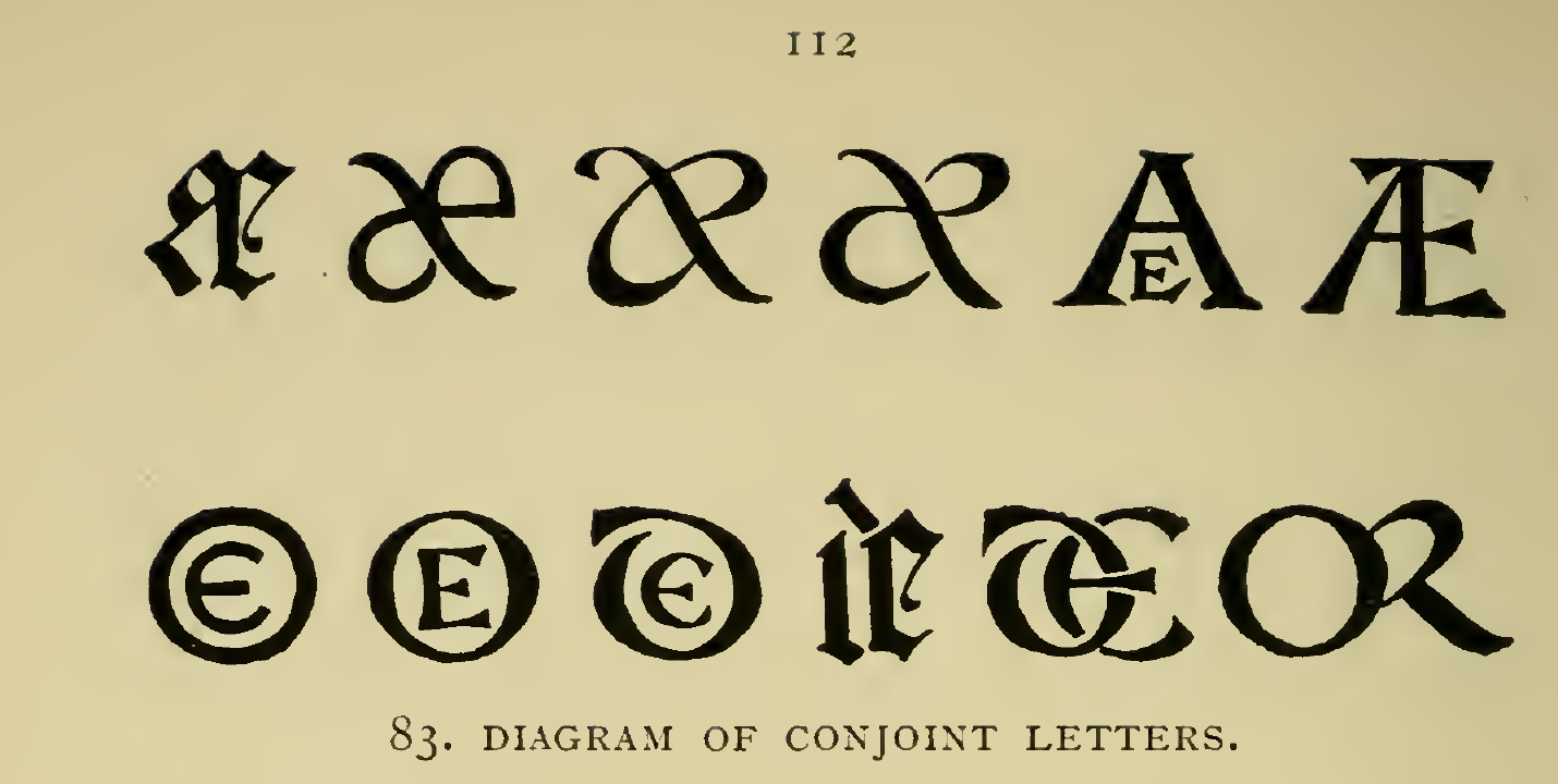
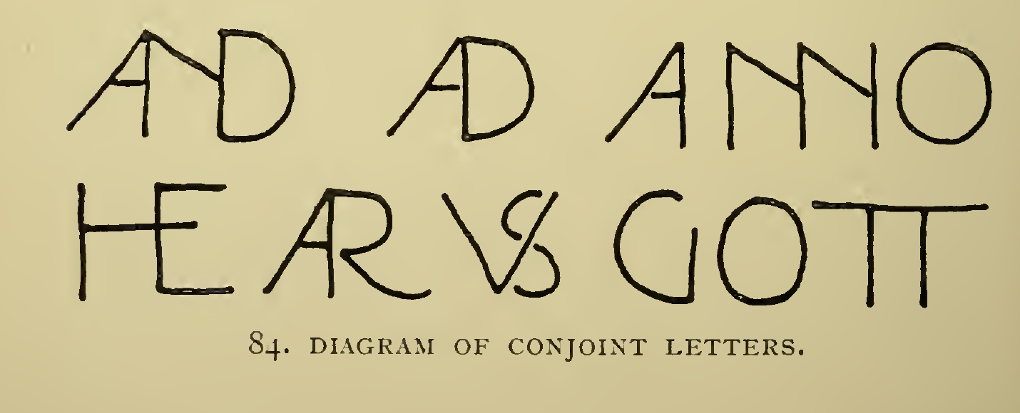
The useful question is not how many strokes can be combined. It is whether the shared line makes the word feel like one designed unit without making the reader stop to decode it. Day’s chapter describes the craftsperson’s freedom to depart from fixed type forms, but still sets legibility as the aim.
Apply it to a memorial inscription sketch
Section titled “Apply it to a memorial inscription sketch”Use this as a present-day paper study, not as a carving specification:
- Write the exact inscription in its intended reading order and mark the primary name or phrase.
- On a tracing overlay, circle one adjacent pair that leaves an awkward gap or a loose rhythm. Keep the normal forms visible on a comparison copy.
- Try one shared stroke for that pair. Do not remove a letter, reverse it, or make the reader infer a missing part.
- Compare both versions at the planned panel size and from a few steps away. Ask someone unfamiliar with the wording to read it without a hint.
- Keep the ordinary forms if the join slows recognition, weakens the name’s emphasis, or only works when viewed close up.
This is a small option within letter spacing, not a replacement for careful optical spacing. It concerns adjacent letters within a word or short abbreviation; for initials designed as a single emblem, see monograms and initials. Day’s examples are historical drawings, not a contemporary monument-shop standard or a template for cutting stone.
Source and image credit
Section titled “Source and image credit”Lewis Foreman Day, Lettering in Ornament: An Enquiry into the Decorative Use of Lettering, Past, Present, and Possible, Chapter VIII, “Conjoined Letters,” printed pp. 107-113 (Archive PDF pp. 143-149). Figs. 83 and 84 are both captioned “Diagram of conjoint letters,” on printed p. 112 / Archive PDF p. 148. Day’s descriptive list (printed p. xvii / PDF p. 29) calls Fig. 83 “conjoint letters of various periods” and Fig. 84 a diagram. The caption and list do not identify an individual draughtsman; none is inferred. The title leaf is undated; the exact Smithsonian-contributed Archive item catalogs this edition as 1902. Its “No Copyright - United States” designation is item-level U.S. evidence, not a worldwide rights determination. The PNGs are source-faithful crops from the exact 400 ppi scan render; the JPEGs are separate display derivatives. The complete PDF remains in private review storage. See the Day source record.