Design the label for its words
In Chapter VI, “Scrolls or Labels,” Lewis Foreman Day treats a ribbon as an inscription field with its own path and visible faces. The words and the bends belong to one design problem: a decorative twist can make a label lively, but it can also turn a phrase away from the reader.
Follow the words through the form
Section titled “Follow the words through the form”Day compares two engravings by H. S. Beham. Fig. 57 is a bookplate; Day says its words do not follow the direction of the label. In Fig. 58 the letters flow along the band, but the inscription occupies both sides. Each example shows a different cost of treating the ribbon’s contours as a complete reading plan.
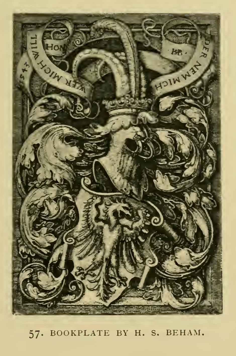
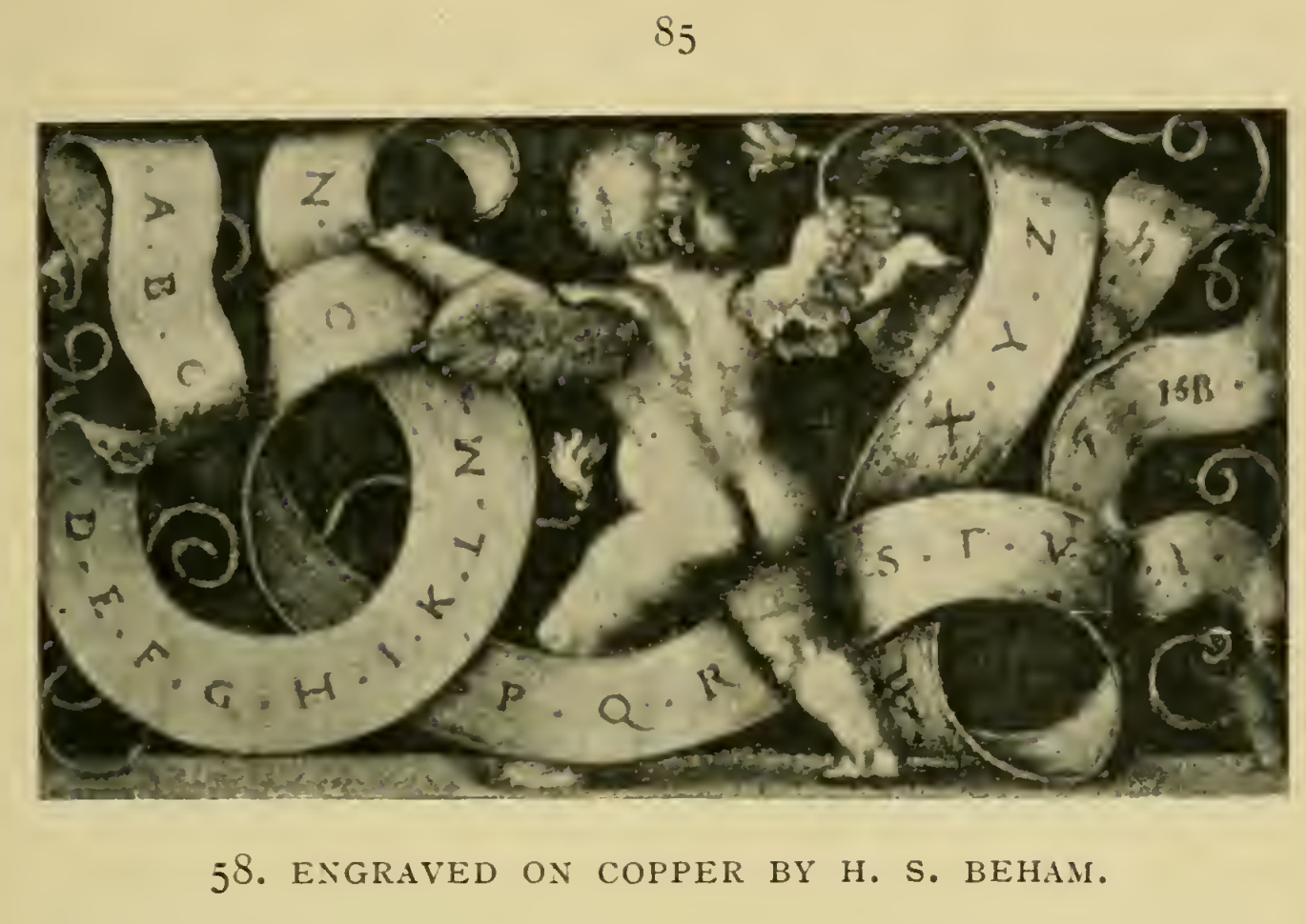
Day’s design rule is to decide the words and their order first, then shape the label around them. He treats a twist as a convention for the reader, not a literal promise that every letter follows the ribbon onto its back or disappears under a fold. A fold can mark a break in the wording; a word should not be split just to satisfy a turn.
Make a label study
Section titled “Make a label study”For a present-day memorial sketch, try this as a drawing exercise, not as a stoneworking procedure:
- Write the exact inscription before drawing a border or ribbon.
- Mark its reading order and natural phrase breaks.
- Sketch the visible ribbon faces around those word groups; keep each group oriented for the same reader.
- Move a fold or turn to a phrase break if it interrupts the words, then redraw the label until its path and text read together.
This short study adapts Day’s historical design discussion. It does not prescribe a carving method, lettering specification, or current shop practice. For rectangular panels and line planning, compare Day’s inscription-composition lesson; for a different shaped field, see Johnston and Gill on inscription layout.
Source and image credit
Section titled “Source and image credit”Lewis Foreman Day, Lettering in Ornament, Chapter VI, “Scrolls or Labels,” printed pp. 75–86 (Archive PDF pp. 111–122). Fig. 57 is on printed p. 83 / PDF p. 119; its caption credits “H. S. Beham.” Fig. 58 is on printed p. 85 / PDF p. 121; its caption specifies “Engraved on copper by H. S. Beham.” Day compares their lettering placement on printed p. 86 / PDF p. 122. The scanned title leaf is undated; the exact Smithsonian-contributed Internet Archive item catalogs this edition as 1902. Its “No Copyright – United States” designation is item-specific U.S. evidence, not a worldwide rights determination. See the Day source record.
The source PDF remains in private review storage. These are selected, unadjusted crops from 400 ppi page renders; the linked PNGs retain the larger crop, and the JPEGs are separate display derivatives.