Roman letters
Robert L. Cook, Huger Elliott and A. S. Hill favored classic Roman capitals for memorials. Their articles advocate a design tradition; other pages in the trade literature document block letters, blackletter and ornamental forms. (LM PDF pp.90-99; GMB16 PDF pp.521-523, 669)
Cook and Elliott’s models
Section titled “Cook and Elliott’s models”Cook preferred a sturdy antique Roman for granite over the delicate forms he associated with Renaissance marble. Elliott used the square and circle to compare letter widths, taking O as a reference rather than making every letter equally wide. These models are starting points for reading their alphabets, not the only historically valid Roman forms. (LM PDF p.91; GMB16 PDF pp.521-522)
Stroke and serif relationships
Section titled “Stroke and serif relationships”Both described contrasting heavy and light strokes. Cook favored a vertical axis in round letters; Elliott accepted diagonal stress when C, G, O and Q remained consistent. Elliott also related serif size and direction to the surrounding space. (LM PDF p.94; GMB16 PDF pp.522-523)
| Form | Elliott’s comparison |
|---|---|
| B | Upper bowl smaller than lower. |
| E | Upper arm shorter than lower; middle arm above center. |
| H | Crossbar slightly above center. |
| S and X | Upper part smaller than lower. |
These selected features describe Elliott’s model, not a complete alphabet specification. (GMB16 PDF pp.522-523)
Letters, figures and readers
Section titled “Letters, figures and readers”Cook and Elliott discouraged antique V for U in contemporary inscriptions because it could interfere with reading. Cook adapted figures associated with Georgian lettering; Elliott described figures through circles and straight lines. Their treatment of J, U, W and numerals shows a revival adapted to contemporary names and dates. (LM PDF p.99; GMB16 PDF pp.594-595)
Optical corrections explains apparent height and weight. Monumental alphabets locates the plates.
From written form to cut capital
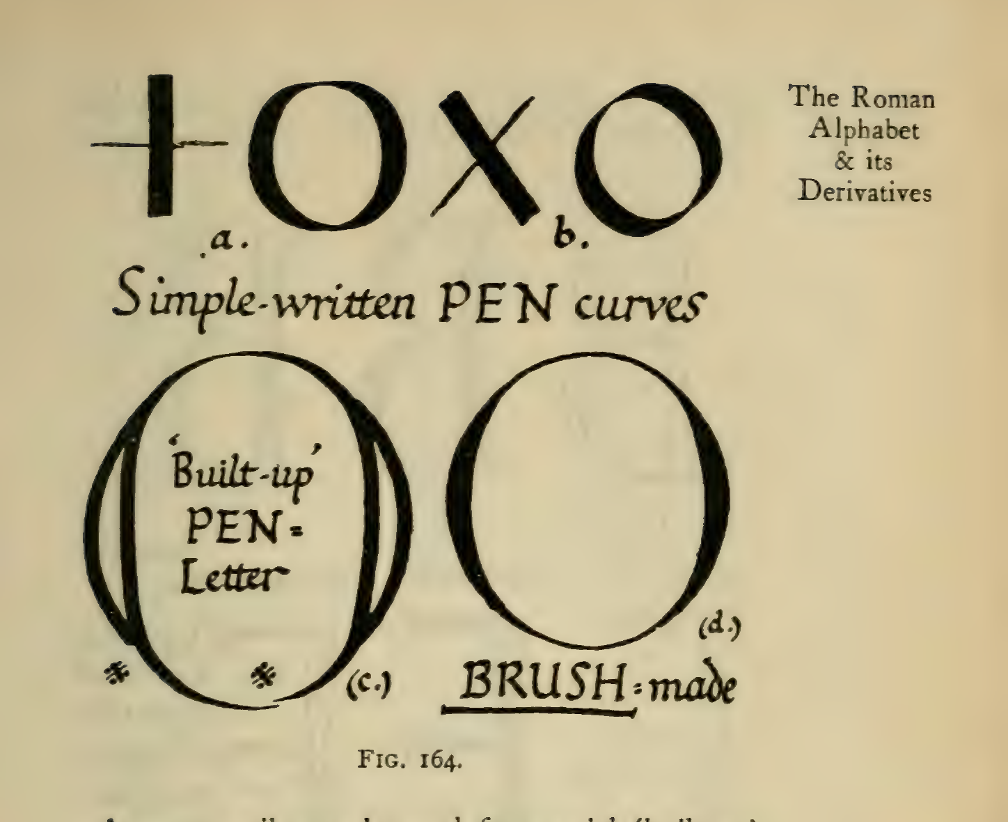
Section titled “From written form to cut capital”Johnston separates several related but different acts. A simple-written pen curve records a moving tool; a built-up pen capital is drawn by combining strokes; a letter cut in stone must also account for the chisel and the material. The plate compares the first two with a brush-made form. It is a way to see how the tool changes a letter’s structure, not a claim that one tool’s result can be copied unchanged into another. For the pen’s edge and stroke direction, see broad-edged pen.
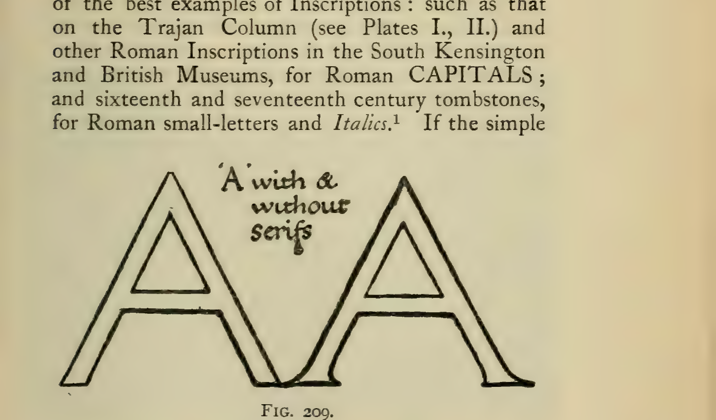
Gill’s next example compares an A without serifs and one with serifs. It helps explain how the finish at a stroke end can affect the character of a cut letter. Treat this as an observed relationship in the historical example, not a fixed rule for every Roman alphabet.
- Optical corrections in lettering
- Letter spacing
- Broad-edged pen: how the edge makes the stroke
- Gothic and Old English letters
- Blackletter construction, spacing and page color
- Monumental alphabets
- Wyckoff Colonial (a digitized Colonial Roman)
Sources
Section titled “Sources”- LM p.87–99 (Robert L. Cook).
- GMB16 p.521–523, 594–595 (Huger Elliott); GMB16 p.669 (A. S. Hill).
Source and editorial credit
Section titled “Source and editorial credit”LM publication record · GMB16 publication record.
This is a modern AI-assisted editorial summary. Named contributors are credited with their specific statements above; unidentified contributors remain unverified. Publication editors are not assumed to have written individual articles. Page references use the private scan; source access, edition and rights limitations are recorded in the linked register.